Living Room Design or design in general is highly personal. Your space should speak to you while sharing your story. It is not a mistake if the design was intentional. Remember that these are not hard-set rules that you should follow. I mean, seriously, don’t listen to anything I say. Just keep them in mind so when the time comes, you can make an informed decision about how to best design your space.
Scale and Proportion
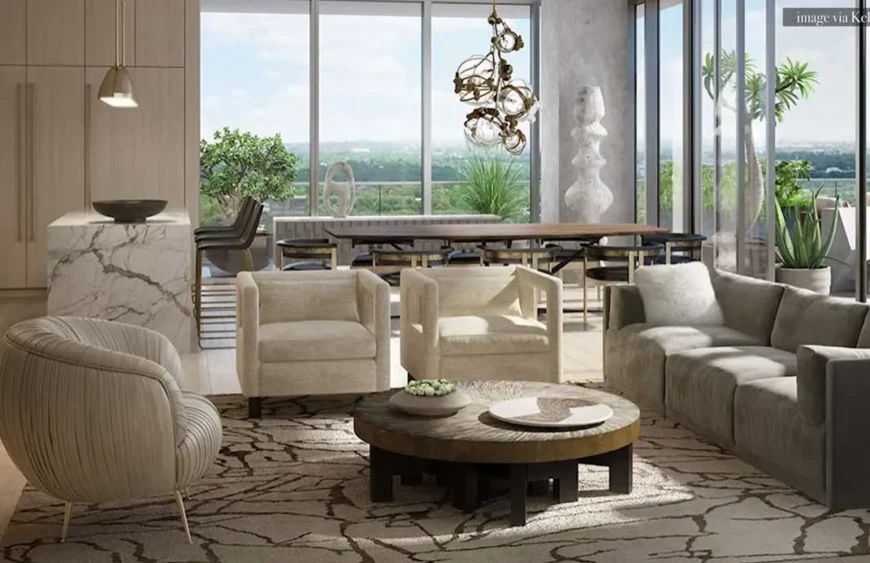
The most common Living Room Design mistake, I want to start with has to do with scale and proportion. Let’s talk about the number one mistake made in living rooms; choosing the wrong sofa. You need to select a sofa that is the correct size for your space. So of course, the first thing you have to do is measure the room. Once you measure the room and you know the dimensions that you can play around with, next you need to choose a sofa that is super comfortable. I mean, comfort is key in the living room and your sofa is the main attraction. It all starts with a really great floor plan, so make sure that you take accurate measurements, sketch out your seating group accordingly, and plan for the correct size of your sofa in the space.
Centre Rugs
Moving on to the rugs. A too small rug can make a room look so much smaller, so don’t make this costly mistake. The perfect rug helps to define the space and anchor the main seating group. A too small rug throws the balance off.
A large rug could be expensive, but a rug is definitely one of the most important elements in a room, so choose a neutral hue with great texture so you can enjoy it for years to come.
Space Planning
Another common mistake is space planning. Space planning has to do with how you lay out all of your furniture and where you place them in relation to the room. The most common mistake I see made in space planning, pushing all of your furniture up against the walls.
For a small space, you are absolutely okay to anchor the wall with one large piece of furniture. That could be your sofa, it could be the couch, it could be a sectional. But how to create a cozy and intimate seating group all depends on how you float the remaining pieces in space. What does that mean? Start with your focal wall and anchor the largest sofa opposite the focal wall. Once you have the largest piece in place, then you can plop a coffee table in front of it, and then square off the space to create an intimate seating group with maybe a club chair or an accent chair. You will create almost like a right angle, or you can even put that accent chair in a corner that faces that main seating group.
The goal is to create an intimate seating group where all users of the space could see each other, talk to each other, have a conversation, and it’s really cozy, intimate, and inviting. I understand the intent by pushing all of your furniture up against the walls. You want to create the illusion of having more space.
If you push all of your furniture up against the walls in the living room, what you’re actually creating is a space that is devoid of any function except to primarily watch the television. The function of a living room is to live in it, engage with others, have a conversation, sit for coffee or tea, and start a discussion. You want to be able to have eye contact with the person sitting in the room with you, have a conversation, and not have to scream across a room just to be heard.
Taking Advantage of the View
Another common design mistake I see made is not taking full advantage of the view. First, you need to determine the view or the focal point in your living room. Is it the fireplace? Is it that gorgeous pool in your backyard? Is it your tree-lined streets in the front yard? Once you determine the view or the focal point, you’ll probably have second thoughts facing the sofa primarily towards the TV.
Let’s talk about lighting.
You have one source of lighting and it’s coming from above. It might be recessed lights, it could be a single fixture, but what you want to create is a cozy and relaxing living room by washing the space with layers of light.
Play around with floor lamps and table lamps on side tables and consoles, install wall sconces, and always place your lighting on dimmers for optimum control of the mood.
Layers of different light sources, heights, and brightness will produce a well thought out lighting plan that feels warm and inviting. If your living shares a common space with your dining, get a pendant light thst compliments.
Window Treatments
Since, I want this article to be comprehensive, I will make it a bit brief, hanging your panels at the incorrect height will break your room and kill the design faster than if you painted an accent wall on a bold bright color and called it a day.
So where to install your rod? Approximately three to four inches below your ceiling height, not at the height at the top of your window frame, but also consider the size of the finial in relation to the ceiling and the windows. If you have a sloped ceiling, hang it at the highest portion of the lowest slope.
If you have a double height arch window above a row of rectangular or square windows, you’ll want to hang your window treatments right above that row of windows. If you have bay windows inset in a recessed niche, the highest point of that niche is considered the ceiling height. Installing your window treatments at the correct height will make the room feel larger, grander, and elevated as a result. The correct length of your panels is when the curtains or the drapery barely kisses the floor. This means that they barely touch the ceiling. The correct width is at least 12 inches away from the left and right sides of the frame so your panels can stack and clear the opening to let the maximum amount of light filter through.
Furniture Choices
Let’s talk about the common mistakes made when it comes to furniture. A matchy, matchy living room design set. If you saw a really cool console at the furniture store and thought, oh my gosh, I love this piece, I love the finish, and hey, look, it comes with a matching coffee table, there’s matching end tables, that’s awesome. And while we’re at it, I love this sofa, and look, it comes with matching accent chairs. I mean, I just made two decisions and boom, I’m done.
You think making those selections was easy peasy, but you’re in for a treat. What you got instead is this one-dimensional space that screams, I just came out of a box. Well, not literally one box, but you get the idea. Like it came out of a big box store or page five of your home decor catalog.
There are two things that I always steer clear of in interior design. One is matchy matchy anything, and two is accent walls, but more on that later. Break up the set by purchasing your favorite statement piece first, let’s say it’s that TV console you love, and mix it up with something interesting and dynamic, like a completely contrasting finish or color for your other surface pieces.
My rule is same function, different finish. If you’re shopping for tables and surfaces, have only one wood statement piece mixed with one metal piece or another wood in different finishes. The same is true for fabrics and textiles. Change up the patterns and colors in the space so your room coordinates. Keep bold prints relegated to statement pieces and not splattered throughout the entire space. The goal is to aim for a fresh mix of textures, sizes, finishes, even maybe styles in different eras. As long as you get the scale and proportion right, an intentional color palette can really tie everything in together.
Surface Space
Another common design mistake I see made is not enough surface space. I always design living rooms with this key aspect in mind. For every seat in the room, make sure there’s adequate surface space for it nearby. Let’s say you have a sofa, a loveseat, and an accent chair on the corner. Every person who sits in this space needs somewhere to place a drink, their phones, a book, the remote control. If the coffee table serves everyone seated, it should be within reach. If not, a quick fix is an end table next to the far end of the sofa, maybe even flanking both sides for symmetry and balance. If you don’t have sufficient space, try a slim sofa console behind the sofa that can double as a beautiful entry table into the living room so you’re not greeted by the back of the sofa.
Too many pieces of decorative furniture.
A China hutch without China in the living room, a display cabinet with all of the souvenirs you’ve ever collected from your decades of traveling, that beautiful marble pedestal you couldn’t pass up on sale because you just know that one day you’ll find a use for it. These are a few examples of pieces of furniture you don’t need in your living room. Let’s remove the unnecessary pieces and reserve your living room for only the furniture you know serves a meaningful purpose. If it doesn’t inspire you or serve your daily life, let it go. Do not reserve furniture for the sake of having furniture. Your room will look less cluttered and intentional when you reserve the space for furniture that suits your immediate lifestyle.
Cheap big box furniture.
Poorly made, synthetic, and uncomfortable furniture is the worst design mistake you could make in the living room, especially if you spend a lot of time in it. How can you get comfortable in an uncomfortable sofa? You can’t.
Avoid the hassle of big box store furniture. Remember that design is not a race to the finish. Take time to source the best that you can afford, even if that means purchasing secondhand furniture from Facebook Market, eBay, Etsy, Craigslist. Nothing says I deserve it more than a home filled with quality items that you took the time to save up for and source.
Hanging wall art incorrectly
Hanging wall art incorrectly is one of the most common mistakes I see made, and it really breaks the room. If your art is hung too high or too low, it looks odd, but the problem is most people don’t know what that correct height should be.
Well, clearly, it’s dependent on the people living in the home. How tall you are, how high the ceiling is, where you’re hanging the art piece in relation to the wall. But the rule of thumb is to split the difference of eye levels between the users of the space.
If your eye level is at 54 inches and your partner’s eye level is 66 inches, the average eye level would be 60 inches. So, you would hang the center of the art piece around 60 inches high on the center of the wall. If you’re hanging the art piece above a piece of furniture, let’s say a sofa, make sure that when you lean back, your head is not touching that bottom of the art piece.
You want to give the art piece a little bit of breathing room and negative space below the art piece and above the art piece. But hanging the art on center around eye level is the general rule of thumb.
Decorate sparingly.
Too many framed pictures and knickknacks without sentiment just clutter the space. It’s on your mantel, it’s on the bookshelves, it’s on your coffee table, it’s on an end table, it’s on the sofa, I mean, it really is littering every single surface you see in the living room.
I understand you adore your family and you want to show off your memories, but instead of taking guests down memory lane, you’re actually cluttering the space with mismatched frames, no cohesive storytelling, and it makes the memories seem less special, in my opinion. Choose a few favorites, print them out in black and white, and create a strategic gallery, either in the hallway or a secondary wall.
Don’t make this the focal point of your living room when stylistically, artwork, or personal photography can make more of an impact. And while we’re on the subject of too much, it’s too many knickknacks without any sentiment. I know you’re a collector, a curator, you love to live amongst your things like I do.
I mean, I am a maximalist by nature. However, too much clutter is visually distracting. It makes your space feel frazzled and crams every surface without negative space to rest the eyes.
But too much of a good thing devalues it over time. You still love it, you love to collect it, but choose only the best to display and you’ll bring more meaning to it as a result. On the flip side, another decorating mistake I see is not accessorizing at all.
Let’s talk about painting
You absolutely must avoid painting the entire room until you see samples painted on the walls. I mean, paint those samples on every single wall in the room if you know what’s good for you. I get it, you just want the room done and painted already. However, you will be making this costly mistake of having to fix it down the line if you don’t get the color right.
The swatch that you see online or even in store is rarely what the true color looks like. Lighting, daylight, furniture can alter the look. Always get samples, I mean they cost like $5, but can save you hundreds in the long run and waste the time if you make the wrong choice.
Credit: Julie Khuu